First, save your presentation, clone an existing design and open it for editing. Then you can start to create your own custom designs from the example designs.
Auto Reload
When the current design of your presentation is a custom design (located inside the presentation folder), the preview of the presentation re-loads the design every couple of seconds.
So, when you edit one of the desings inside the designs folder of your presentation, select that design in your current presentation. When you save your changes, you will see the effect they have on your presentation almost immediately.
The Design Editor
The design editor allows you to edit the three main files of your design: design.json, design.css and preview.md.
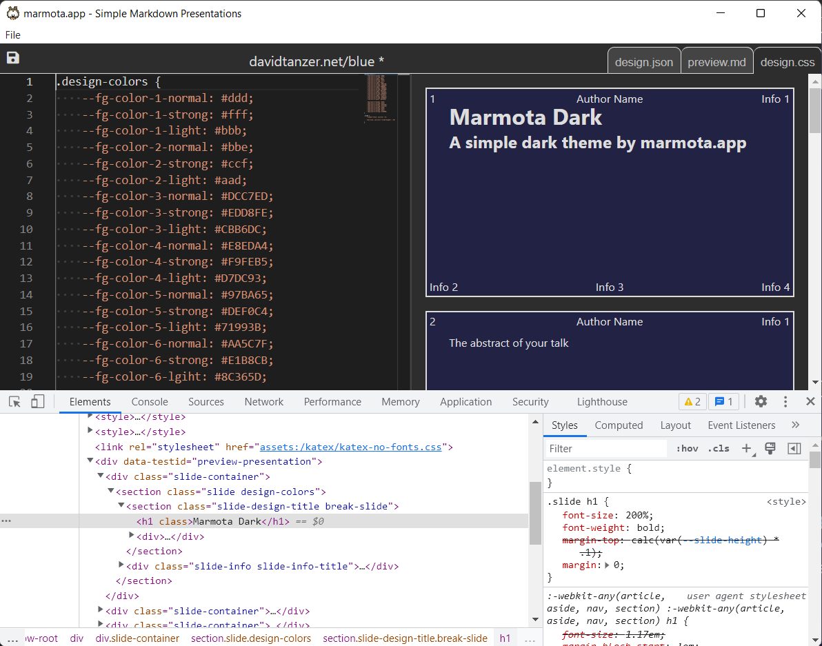
When you edit the preview presentation preview.md or the stylesheet design.css, the right panel will immediately show you the effects of your changes.
In this window, the Chrome Developer Tools are open, so you can debug the effects of your CSS and the structure of the rendered presentation more easily.
When you press CTRL+S or select "Save" from the menu, all your design files are saved. And when your design is selected in a presenation in the main window, the presentation will automatically re-load the design and show your changes.
Design ID and Metadata
The JSON file design.json contains the metadata of the design.
{
	"id": "example.com/simple",
	"basedOn": "marmota.app/common",

	"author": "marmota.app",
	"contact": {
		"email": "hello@marmota.app",
		"web": "https://marmota.app",
		"twitter": "https://twitter.com/MarmotaApp"
	}
}
The path inside the designs folder should match the id of your design. So, if your design id is "example.com/simple", it should be located in designs/example.com/simple.
You were asked to provide an ID in the form [your domain]/[design name] when you cloned the design. Leave that ID as it is. The author and contact entries contain additional information that you can fill in.
When you set basedOn to a design ID of another design, your design will inherit all the CSS of that design. Most existing designs that you can clone inherit all CSS from marmota.app/common. You can choose to not base your design on marmota.app/common, but we do not recommend that: When a new feature needs new CSS, we will implement it in marmota.app/common in a backwards-compatible way. So, by basing your design on this common design, you are always up-to-date.
Your design can also be indireclty be based on marmota.app/common: You can set basedOn to another design that is then based on marmota.app/common.
Common Slide Types
Presentation slides can contain an option called slide-design that selects a different slide design within the design of the presentation. E.g. slide-design=subtitle: This option sets the type of the current slide to subtitle. Your design can render different slide types differently:
The content of such a slide gets the CSS class slide-design-[name], e.g. slide-design-subtitle. The info block of the same slide (which contains the slide number, author information, etc.) gets the CSS class slide-info-[name], e.g. slide-info-subtitle. Use CSS to style the slides and their content differently based on the slide type.
Every design should support the following common slide designs:
title: The title slide of the presentationsubtitle: A subtitle slide, e.g. for a new sectionabout-author: A slide with information about the author / presentertoc: The table of contentsabstract: A short abstract of the presentationhighlight: A slide that contains normal content, but is highlightedconclusions: The conclusions of the presentation
General-Purpose Blocks
Presentations can use Markdown-blockquotes to create general-purpose blocks:
>{render-as=author} A general-purpose block with the
> CSS-class box-author
The blockquote above will not be rendered as a HTML blockquote element, but
as a div with the CSS-class box-author. Your design can support certain
general-purpose blocks by adding CSS styling for the block's name:
.box-author: {
	border: 1px solid var(--fg-color-1-normal);
}
CSS, Images etc.
If you want to use images in your presentation design, you must access them via the special url design:/[design id]/[path to image], e.g.:
.slide > section {
	background-image: url(design:/example/simple/dragonfly-light.jpg);
	background-size: cover;
}
Presentation slides render as HTML with classes added that you can reference in your design. Refer to design.css of the common design to see how marmota.app/common styles the presentation. The most important CSS classes are:
.slide: The outermost section of each slide.slide .color-highlight: A section inside the slide can have the.color-highlightclass when the presentation wants highlight that slide..author: If the presentation has an author set, the name will render here..slide-number: If the presentation is configured to show slide numbers, they will render here..info-1,.info-2,.info-3,.info-4: Additional information will render here..color-alternative: Headlines can be rendered in an alternative color, specified in it's options.shadow: Headlines can be rendered with a shadow, specified in it's options
If a slide contains two columns, it will contain multiple sections, so you can display the columns using:
.slide > section section {
	width: calc(50% - 0.5em);
	float: left;
}
.slide > section section:nth-child(2n) {
	margin-left: 1em;
}
.slide > section section:only-child {
	width: 100%;
	float: none;
}
Syntax Highlighting
Syntax highlighting for source code by default uses the colors you have defined in your design. If that does not match your expectation, you can get more fine-grained control over how syntax highlighting is rendered by defining the following variables:
--syntax-highlight-color-strong--syntax-highlight-color-standard--syntax-highlight-color-1--syntax-highlight-color-2--syntax-highlight-color-3--syntax-highlight-bg-deletion--syntax-highlight-fg-deletion--syntax-highlight-bg-addition--syntax-highlight-fg-addition
The Preview Slide
Your presentation design must also contain a preview presentation called preview.md. The design selector always shows the first slide of that presentation. With this slide, you can make your design easily recognizable and also showcase some features of your design.