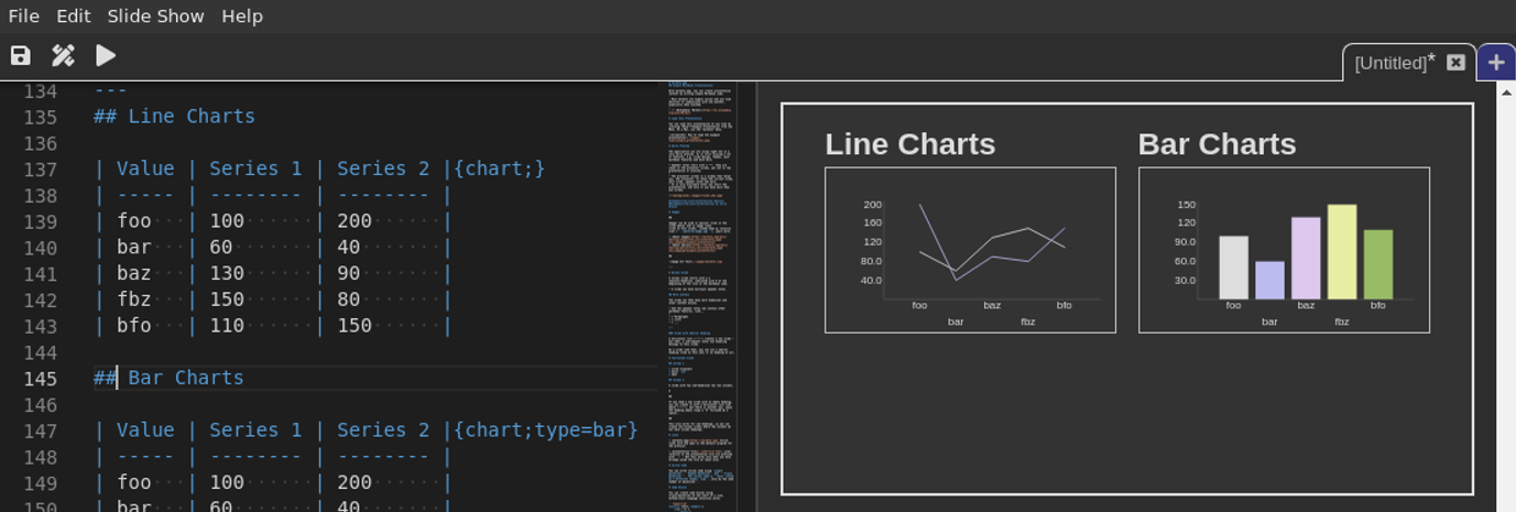
When you want to insert a chart into a presentation, you can do so by defining the chart data in a table. Then, add chart options:

To render a table as a chart, the default option must be chart. All charts support size options that allow you to fine-tune the layout of your presentation.
Y Axis Options
To control rendering of the y-axis of a chart, you can supply multiple options:
yAxisLabelsthe number of labels to render on the axis. Default: 6.yAxisMinthe minimum value of the axis. Default: The minimum value from the data.yAxisMaxthe maximum value of the axis. Default: The maximum value from the data.yAxisPrecisionthe number of significant digits to show, or the string "integer" to round to the next whole number. Default: 3
Example:
---
##
| Value | Data |{chart;type=bar;yAxisPrecision=integer}
| ------| ---- |
|     A |   50 |
|     B |   91 |

##
| Value | Data |{chart;yAxisPrecision=4;yAxisMin=-120;yAxisMax=100;yAxisLabels=9}
| ----- | ---- |
|     A |   50 |
|     B |   91 |
|     C | -100 |
marmota.app currently supports: